Your smartphone is more than just a communication device—it’s a personal statement that reflects your style, personality, and aesthetic sensibilities. While many users stop at changing their wallpaper or downloading a new ringtone, creating a truly cohesive phone theme requires a more thoughtful, holistic approach that transforms your device into a seamless extension of yourself.
Start with Your Foundation: Wallpaper Strategy
The wallpaper sets the tone for your entire theme, but choosing the right one goes beyond picking something that looks nice. Consider the psychological impact of your choice—calming nature scenes for stress reduction, minimalist geometric patterns for focus, or vibrant abstract art for creative inspiration.
For maximum cohesion, select wallpapers that work harmoniously across both your lock screen and home screen. Many users make the mistake of choosing competing images that create visual chaos. Instead, opt for complementary pieces from the same color palette or artistic style, or use different sections of the same high-resolution image.
The Color Psychology of Interface Design
Your phone’s color scheme should flow naturally from your wallpaper choice. Most modern smartphones offer extensive customization options for accent colors, notification styles, and interface elements. Choose a primary color and two supporting tones that appear in your wallpaper, then apply these consistently across your theme.
Cool blues and greens promote calm and focus, making them ideal for productivity-focused themes. Warm oranges and reds energize and inspire creativity, while monochromatic schemes in grays and blacks project sophistication and minimize distractions.
Icon Organization: Function Meets Form
App icon arrangement is where functionality and aesthetics must find perfect balance. Group related apps not just by function, but by visual weight and color harmony. Photo editing apps with similar color schemes can be clustered together, while productivity tools in muted tones can occupy their own dedicated space.
Consider using custom icon packs that align with your overall theme. Minimalist themes benefit from simple, outlined icons, while maximalist approaches might incorporate detailed, colorful designs. The key is consistency—mixing multiple icon styles destroys the cohesive effect you’re working to achieve.
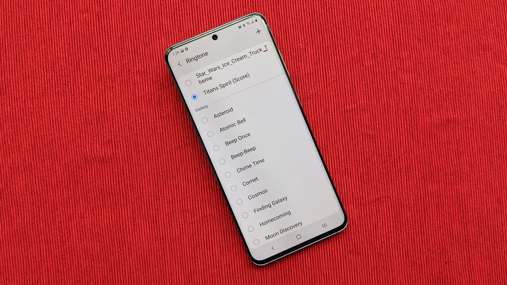
Sound Design: The Often-Overlooked Element
Audio elements are crucial components of a cohesive theme that most users completely ignore. Your ringtone, notification sounds, keyboard clicks, and system alerts should all complement each other and reinforce your chosen aesthetic.
For nature-inspired themes, gentle chimes and water sounds create consistency. Tech-focused themes might employ subtle electronic tones and futuristic beeps. Classical music lovers might choose baroque melodies for calls and harpsichord plucks for notifications. The goal is creating an audio landscape that feels intentional rather than random.
Widget Harmony and Information Architecture
Widgets offer powerful customization opportunities but can easily become cluttered eyesores. Choose widgets that serve genuine purposes while maintaining visual consistency with your theme. Weather widgets should match your color scheme, calendar widgets should complement your chosen fonts, and music widgets should align with your overall aesthetic direction.
Resist the urge to fill every available space with widgets. Negative space is a design tool that allows your chosen elements to breathe and maintain visual impact.
Advanced Customization Techniques
Power users can achieve even greater cohesion through advanced customization options. Custom keyboards that match your theme, notification LED colors that align with your palette, and even charging animations that complement your aesthetic all contribute to a seamless experience.
Consider seasonal adjustments to keep your theme fresh while maintaining consistency. Autumn themes might incorporate warmer tones and nature sounds, while winter versions could emphasize cooler colors and more minimalist approaches.
The Maintenance Mindset
A truly cohesive phone theme requires ongoing curation. Regularly audit your apps, removing those that don’t serve your current needs or fit your aesthetic. Update widgets seasonally, refresh wallpapers periodically, and ensure that new app additions align with your established visual language.
Remember that the most successful phone themes evolve gradually rather than through dramatic overhauls. Small, consistent adjustments maintain cohesion while allowing for personal growth and changing preferences.
Making It Personal
The ultimate goal isn’t perfection—it’s creating a digital environment that genuinely reflects who you are and supports how you want to interact with technology. Your phone theme should feel like a natural extension of your personal style, whether that’s minimalist zen, maximalist creativity, or anything in between.
A cohesive phone theme does more than just look good; it creates a sense of intentionality and control over your digital space. In a world where we spend countless hours interacting with our devices, this small act of creative curation can significantly impact our daily experience and overall relationship with technology.
Take the time to craft something uniquely yours—your future self will appreciate the thoughtfulness every time you pick up your phone.